Examples:
deaths_map <- drawCovidMap("06-10-2020","Deaths")
deaths_map
confirmed_map <- drawCovidMap("06-10-2020","Confirmed")
confirmed_map
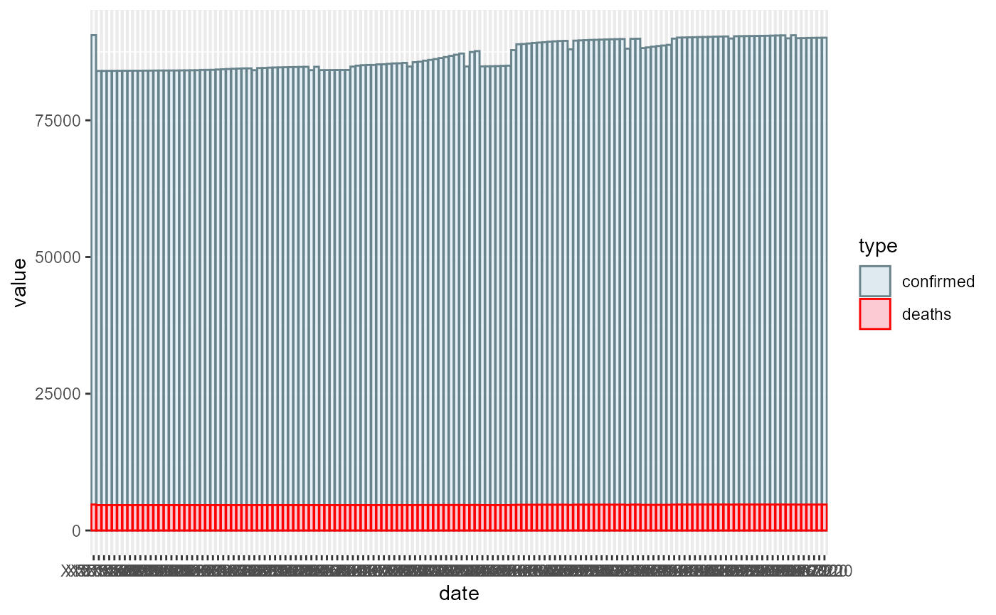
## Want to draw the plot of the number of covid-19 deaths and confirmed cases during a time series in a specific country? ## Use “drawCovidPlot” function ### How to use it: ###### This function gets a vector containing the start and end date of the time series and the name of a specific country as input and throws a ggplot barplot which it’s y-axis is the number of deaths and confirmed cases in that especific country. ###### The date format is like that: “mm-dd-yy” and the format of type should be either “Deaths” or “Confirmed”. ###### Again don’t forget that you should’t pass dates when Covid-19 hadn’t appeared yet ###### An example:
deaths_plot_1 <- drawCovidPlot(c("05-13-2020","06-10-2020"),"US")
#>
#> Attaching package: 'dplyr'
#> The following objects are masked from 'package:stats':
#>
#>     filter, lag
#> The following objects are masked from 'package:base':
#>
#>     intersect, setdiff, setequal, union
#> -- Attaching packages -------------------- tidyverse 1.3.0 --
#> v ggplot2 3.3.2     v purrr   0.3.4
#> v tibble  3.0.3     v stringr 1.4.0
#> v tidyr   1.1.2     v forcats 0.5.0
#> -- Conflicts ----------------------- tidyverse_conflicts() --
#> x tidyr::complete() masks RCurl::complete()
#> x dplyr::filter()   masks stats::filter()
#> x dplyr::lag()      masks stats::lag()
#>
#> Attaching package: 'reshape'
#> The following objects are masked from 'package:tidyr':
#>
#>     expand, smiths
#> The following object is masked from 'package:dplyr':
#>
#>     rename
deaths_plot_1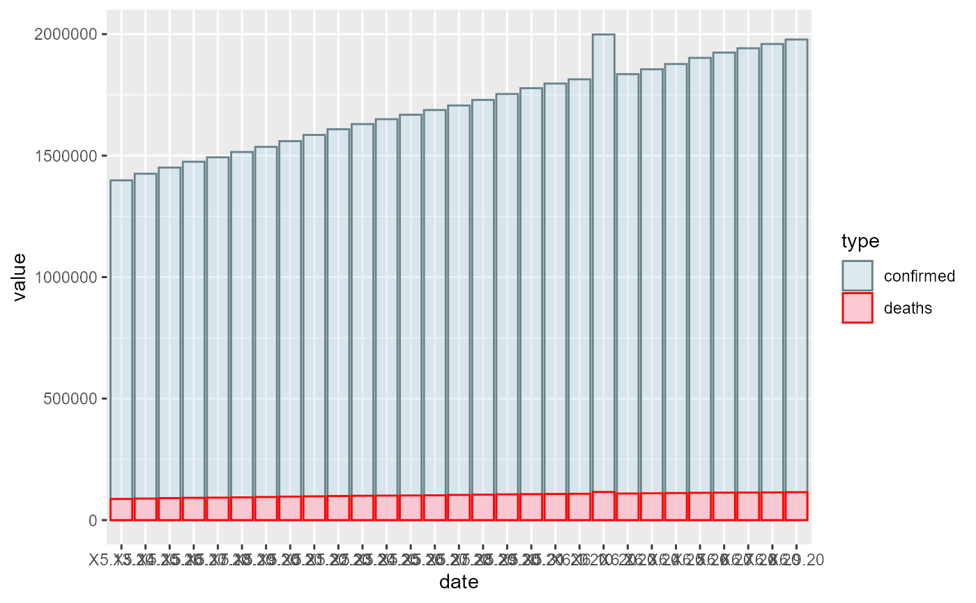
confirmed_plot_2 <- drawCovidPlot(c("05-13-2020","10-01-2020"),"China")
confirmed_plot_2